Machine Learning Programming Skills
Learn foundational machine learning concepts and techniques. This tutorial covers Linear Regression, Logistic Regression, Decision Trees, and K-Nearest Neighbors with practical examples and Python code.
Machine Learning (ML) helps people in various industries turn data into valuable insights and actionable predictions. For instance, if you work in the car manufacturing industry, you might receive a Net Promoter Score (NPS) at the end of each month. This score, a single number derived from extensive data, reflects customer satisfaction. As a leader, you might want to know which aspects of customer feedback impact your NPS the most and ask for this information in percentages. An analyst can use regression analysis to determine these percentages.
This tutorial will guide you through foundational ML concepts and techniques, including basic algorithms, model evaluation metrics, and feature engineering. We will explore four models with from end to end including data import: Linear Regression, Logistic Regression, Decision Trees, K-Nearest Neighbors (KNN).
Please remember: ML models over-fit on training data sometimes, so don't be excited when you see high accuracy. Use Five fold cross validation to make sure it is not.
1. Linear Regression
Linear Regression is the most basic and common algorithm in machine learning, although its basic but still use commonly used in industry these days. It is a statistical model which estimates the linear relationship between a scalar response (dependent variable) and one or more explanatory variables (independent variable). Lets see one example in detail:
Example: Predicting House Prices
Dataset: You can use the Boston Housing dataset or the Kaggle House Prices dataset. or download from here:
Click here for code explain
Above Python code is designed to build and evaluate a linear regression model for predicting house prices based on a dataset. Here's a breakdown of the code:
- Importing Libraries:
pandas(pd): For data manipulation and analysis.LinearRegressionfromsklearn.linear_model: To create and use the linear regression model.train_test_splitfromsklearn.model_selection: For splitting the dataset into training and testing sets.mean_squared_error,r2_scorefromsklearn.metrics: For evaluating the model's performance.matplotlib.pyplot(plt): For plotting the results.
- Loading the Dataset:
- The dataset is loaded from a CSV file named 'house_prices.csv' using
pd.read_csv(). - The feature variables (
X) are 'size' and 'rooms', representing the size of the house and the number of rooms. - The target variable (
y) is 'price', representing the house price.
- Splitting the Data:
- The dataset is split into training and testing sets using
train_test_split(). X_trainandy_trainare the features and target variable for the training set.X_testandy_testare for the testing set.test_size=0.2means 20% of the data is reserved for testing, while the remaining 80% is used for training.random_state=42ensures reproducibility of the split.
- Model Initialization and Training:
- A
LinearRegressionmodel is initialized and then trained usingmodel.fit(X_train, y_train).
- Making Predictions:
- The model makes predictions on the testing set (
X_test) usingmodel.predict().
- Evaluating the Model:
mean_squared_error(y_test, predictions): Calculates the Mean Squared Error (MSE), a measure of the average squared difference between the actual and predicted values.r2_score(y_test, predictions): Calculates the R-squared (R²) score, indicating the proportion of the variance in the dependent variable that is predictable from the independent variables.
- Visualization:
- A scatter plot is created to visualize the actual versus predicted house prices.
- The
X_test['size']values are plotted against the actual (y_test) and predicted (predictions) prices. - The actual values are shown in blue, and the predicted values are shown in red.
The plot provides a visual representation of how well the model's predictions match the actual prices, with close points indicating good predictive performance.
import pandas as pd
from sklearn.linear_model import LinearRegression
from sklearn.model_selection import train_test_split
from sklearn.metrics import mean_squared_error, r2_score
import matplotlib.pyplot as plt

# Load dataset
data = pd.read_csv('house_prices.csv')  # Replace with actual dataset path
X = data[['size', 'rooms']]  # Features
y = data['price']  # Target variable

# Split data into training and testing sets
X_train, X_test, y_train, y_test = train_test_split(X, y, test_size=0.2, random_state=42)

# Initialize and train the model
model = LinearRegression()
model.fit(X_train, y_train)

# Predict on the test set
predictions = model.predict(X_test)

# Evaluate the model
mse = mean_squared_error(y_test, predictions)
r2 = r2_score(y_test, predictions)
print(f'Mean Squared Error: {mse}')
print(f'R-squared: {r2}')

# Visualization
plt.scatter(X_test['size'], y_test, color='blue', label='Actual')
plt.scatter(X_test['size'], predictions, color='red', label='Predicted')
plt.xlabel('Size')
plt.ylabel('Price')
plt.title('House Price Prediction')
plt.legend()
plt.show()
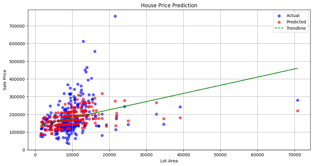
You can try non linear regression, you will get better r2 score 😃 or try more features because here we used only two features.
2. Logistic Regression
Supervised machine learning algorithm that accomplishes binary classification tasks by predicting the probability of an outcome, event, or observation. For example pass or fail in exam. alive or dead classification.
Example: Predicting Exam Pass/Fail
Dataset: You can use the Exam Scores dataset from Kaggle.
Click here for code explain
- Importing Libraries:
- pandas (pd): For data manipulation and analysis.
- LogisticRegression from sklearn.linear_model: To create and use the logistic regression model for binary classification.
- train_test_split from sklearn.model_selection: For splitting the dataset into training and testing sets.
- accuracy_score, classification_report from sklearn.metrics: For evaluating the model's performance in terms of accuracy and detailed classification metrics.
- matplotlib.pyplot (plt): For plotting the results and visualizing the data.
- seaborn (sns): For creating enhanced data visualizations with additional aesthetic features.
- Loading the Dataset:
- The dataset is loaded from a CSV file named 'exam_scores.csv' using
pd.read_csv(). - The original data is inspected with
data.head()to understand its structure and contents.
- Creating the 'pass' Column:
- A new column named 'pass' is created, where:
- 1 indicates the student passed (if their math score is 50 or above).
- 0 indicates the student failed (if their math score is below 50).
- This is done by checking if the 'math score' is greater than or equal to 50 and converting the boolean result to integers using
.astype(int).
- Feature and Target Selection:
- Feature (X): The
math scorecolumn is selected as the feature variable. - Target (y): The newly created
passcolumn is used as the target variable.
- Splitting the Data:
- The dataset is split into training and testing sets using
train_test_split(). X_trainandy_train: Feature and target variables for the training set.X_testandy_test: Feature and target variables for the testing set.
- test_size=0.2: 20% of the data is reserved for testing, while the remaining 80% is used for training.
- random_state=42: Ensures the data split is reproducible.
- Model Initialization and Training:
- A
LogisticRegressionmodel is initialized and trained usingmodel.fit(X_train, y_train). - This model predicts the probability of a student passing based on their math score.
- Making Predictions:
- The model makes predictions on the testing set (
X_test) usingmodel.predict(). - The predictions are binary (1 for pass, 0 for fail) based on the learned threshold.
- Evaluating the Model:
- accuracy_score(y_test, predictions): Calculates the accuracy of the model, indicating the proportion of correct predictions.
- classification_report(y_test, predictions): Provides a detailed performance report, including precision, recall, and F1-score for each class (pass/fail).
- Visualization:
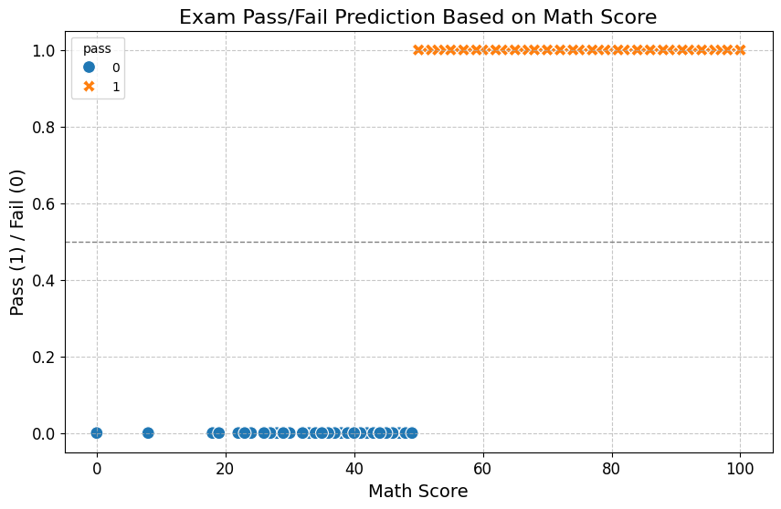
- A scatter plot is created to visualize the relationship between
math scoreand thepassstatus. - The plot includes different markers and colors for the pass (1) and fail (0) outcomes, with an added horizontal line indicating the pass threshold.
- The plot provides a visual representation of the model's decision boundary and how well it separates the pass/fail classes based on math scores.
# First, let's load the dataset and inspect it to understand its structure.
import pandas as pd

# Load the dataset
file_path = 'exam_scores.csv'
data = pd.read_csv(file_path)

# Display the first few rows of the dataset
data.head()
# Create a new column 'pass' based on the 'math score'
# Assuming a passing score is 50 or above
data['pass'] = (data['math score'] >= 50).astype(int)

# Use 'math score' as the feature and 'pass' as the target
X = data[['math score']]
y = data['pass']

# Split the data into training and testing sets
from sklearn.model_selection import train_test_split
X_train, X_test, y_train, y_test = train_test_split(X, y, test_size=0.2, random_state=42)

# Initialize and train the Logistic Regression model
from sklearn.linear_model import LogisticRegression
model = LogisticRegression()
model.fit(X_train, y_train)

# Predict on the test set
predictions = model.predict(X_test)

# Evaluate the model
from sklearn.metrics import accuracy_score, classification_report
accuracy = accuracy_score(y_test, predictions)
report = classification_report(y_test, predictions)

# Print the evaluation results
print(f'Accuracy: {accuracy}')
print(f'Classification Report:\n{report}')

import matplotlib.pyplot as plt
import seaborn as sns

# Improving the plot by adding better visuals, such as clearer markers, grid, and a vertical line indicating the threshold.
plt.figure(figsize=(10, 6))

# Scatter plot with improved aesthetics
sns.scatterplot(x='math score', y='pass', data=data, hue='pass', style='pass', s=100)

# Adding a horizontal line at the threshold (pass/fail boundary)
plt.axhline(y=0.5, color='gray', linestyle='--', linewidth=1)

# Adding grid for better readability
plt.grid(True, linestyle='--', alpha=0.7)

# Title and labels with improved size and clarity
plt.title('Exam Pass/Fail Prediction Based on Math Score', fontsize=16)
plt.xlabel('Math Score', fontsize=14)
plt.ylabel('Pass (1) / Fail (0)', fontsize=14)
plt.xticks(fontsize=12)
plt.yticks(fontsize=12)

# Display the plot
plt.show()
3. Decision Trees
A decision tree is a flowchart-like model used for making decisions or predictions based on a series of rules derived from data features. Each internal node represents a decision based on a feature attribute, each branch represents the outcome of that decision, and each leaf node represents a final decision or classification. Let's see an example here:
Example: Predicting Customer Purchase
Dataset: You can use a synthetic dataset or a real-world dataset like the Online Shoppers Purchasing Intention dataset from UCI.
Click here for code explain
- Importing Libraries:
- pandas (pd): For data manipulation and analysis.
- DecisionTreeClassifier from sklearn.tree: To create and use the decision tree model for classification tasks.
- train_test_split from sklearn.model_selection: For splitting the dataset into training and testing sets.
- accuracy_score, classification_report from sklearn.metrics: For evaluating the model's performance, including accuracy and detailed classification metrics.
- matplotlib.pyplot (plt): For plotting and visualizing the decision tree structure.
- plot_tree from sklearn.tree: For visualizing the structure and decisions of the trained decision tree model.
- Loading the Dataset:
- The dataset is loaded from a CSV file named 'customer_data.csv' using
pd.read_csv(). - The data includes various features related to customer behavior and a target variable indicating revenue generation.
- Features and Target Variable:
- Features (X): A set of selected features representing different aspects of customer interactions:
'Administrative','Administrative_Duration': Number and duration of administrative page visits.'Informational','Informational_Duration': Number and duration of informational page visits.'ProductRelated','ProductRelated_Duration': Number and duration of product-related page visits.'BounceRates': Percentage of visitors who leave the site after viewing only one page.'ExitRates': Percentage of page views that are the last in the session.'PageValues': Numeric value assigned to different pages in the context of their likelihood to lead to revenue.'SpecialDay': Special day indicator, typically values between 0 and 1.
- Target (y): The target variable is
Revenue, which indicates whether a transaction was made (True) or not (False).
- Converting Categorical Target to Numerical:
- The
Revenuecolumn, initially categorical (True/False), is converted to numerical values: Truebecomes1(indicating a transaction was made).Falsebecomes0(indicating no transaction).
- Splitting the Data:
- The dataset is split into training and testing sets using
train_test_split(). X_trainandy_train: Features and target variable for the training set.X_testandy_test: Features and target variable for the testing set.
- test_size=0.2: 20% of the data is reserved for testing, with the remaining 80% used for training.
- random_state=42: Ensures the data split is reproducible.
- Model Initialization and Training:
- A
DecisionTreeClassifiermodel is initialized and trained usingmodel.fit(X_train, y_train). - This model learns to classify customers into those who generate revenue and those who do not based on their features.
- Making Predictions:
- The model predicts the outcomes on the testing set (
X_test) usingmodel.predict(). - Predictions indicate whether the model thinks a customer will generate revenue (1) or not (0).
- Evaluating the Model:
- accuracy_score(y_test, predictions): Calculates the accuracy of the model, indicating the proportion of correct predictions.
- classification_report(y_test, predictions): Provides a detailed performance report, including precision, recall, and F1-score for both classes (revenue/no revenue).
- Visualization:
- A plot is created to visualize the structure of the trained decision tree.
plot_tree(model, filled=True, feature_names=X.columns, class_names=['No', 'Yes']):- The tree diagram shows the decisions made at each node, with
filled=Truecoloring nodes based on the majority class. feature_namesandclass_nameslabel the features and target classes for clarity.
- The tree diagram shows the decisions made at each node, with
- The plot helps understand how the model makes decisions based on the input features, highlighting the most important factors in predicting revenue generation.
import pandas as pd
from sklearn.tree import DecisionTreeClassifier
from sklearn.model_selection import train_test_split
from sklearn.metrics import accuracy_score, classification_report
import matplotlib.pyplot as plt
from sklearn.tree import plot_tree

# Load dataset
data = pd.read_csv('customer_data.csv')  # Replace with actual dataset path
X = data[['Administrative', 'Informational', 'ProductRelated', 'BounceRates']]  # Features
y = data['Revenue']  # Target variable (True/False)

# Convert categorical target to numerical
y = y.map({True: 1, False: 0})

# Split data into training and testing sets
X_train, X_test, y_train, y_test = train_test_split(X, y, test_size=0.2, random_state=42)

# Initialize and train the model
model = DecisionTreeClassifier()
model.fit(X_train, y_train)

# Predict on the test set
predictions = model.predict(X_test)

# Evaluate the model
accuracy = accuracy_score(y_test, predictions)
report = classification_report(y_test, predictions)
print(f'Accuracy: {accuracy}')
print(f'Classification Report:\n{report}')

# Visualization
plt.figure(figsize=(12, 8))
plot_tree(model, filled=True, feature_names=['Administrative', 'Informational', 'ProductRelated', 'BounceRates'], class_names=['No', 'Yes'])
plt.show()
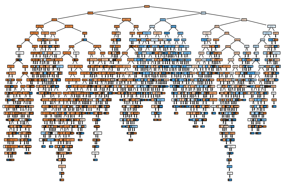
The plot is too messy right ? let visualize it more:
pip install pydotplus
sudo apt-get install graphviz
Then, you can use the following code:
from sklearn.tree import export_graphviz
import pydotplus
from IPython.display import Image

# Export as dot file
dot_data = export_graphviz(model, out_file=None,
                           feature_names=X.columns,
                           class_names=['No', 'Yes'],
                           filled=True, rounded=True,
                           special_characters=True)

# Draw graph
graph = pydotplus.graph_from_dot_data(dot_data)

# Show graph
Image(graph.create_png())
This code will display the decision tree as an image within a Jupyter notebook, allowing you to zoom in and out as needed. You can also save the image to a file with higher resolution for more detailed inspection. You can also save the graph to a file:
graph.write_png('decision_tree.png')
Let's see the plot or see in google colab.
4. K-Nearest Neighbors (KNN)
K-Nearest Neighbors (KNN) is a simple machine learning algorithm that makes predictions by looking at the 'k' closest examples in the data. For classification, it predicts the most common class among these neighbors. For regression, it predicts the average value. The 'closeness' is usually measured by distance, such as how far apart the data points are. Let's see on example:
Example: Classifying Iris Species
Dataset: The Iris dataset is commonly used for this task.
Click here for code explain
- Importing Libraries:
- pandas (pd): For data manipulation and analysis.
- KNeighborsClassifier from sklearn.neighbors: To create and use the K-Nearest Neighbors (KNN) model for classification tasks.
- train_test_split from sklearn.model_selection: For splitting the dataset into training and testing sets.
- accuracy_score, classification_report from sklearn.metrics: For evaluating the model's performance, including accuracy and detailed classification metrics.
- matplotlib.pyplot (plt): For plotting and visualizing the data and model predictions.
- Loading the Dataset:
- The dataset is loaded from a CSV file named 'Iris.csv' using
pd.read_csv(). - The dataset contains measurements of various attributes of iris flowers and their species classification.
- Features and Target Variable:
- Features (X): The
PetalLengthCmandPetalWidthCmcolumns are selected as features. These represent the length and width of the petal, respectively. - Target (y): The
Speciescolumn is used as the target variable, which indicates the species of the iris flower. The species are typically 'Iris-setosa', 'Iris-versicolor', and 'Iris-virginica'.
- Splitting the Data:
- The dataset is split into training and testing sets using
train_test_split(). X_trainandy_train: Features and target variable for the training set.X_testandy_test: Features and target variable for the testing set.
- test_size=0.2: 20% of the data is reserved for testing, while the remaining 80% is used for training.
- random_state=42: Ensures the data split is reproducible.
- Model Initialization and Training:
- A
KNeighborsClassifiermodel with 3 neighbors (n_neighbors=3) is initialized. - The model is trained using
model.fit(X_train, y_train). KNN classifies data points based on the majority class among the nearest neighbors.
- Making Predictions:
- The model predicts the species on the testing set (
X_test) usingmodel.predict(). - Predictions indicate the species classification for each test sample.
- Evaluating the Model:
- accuracy_score(y_test, predictions): Calculates the accuracy of the model, indicating the proportion of correct predictions.
- classification_report(y_test, predictions): Provides a detailed performance report, including precision, recall, and F1-score for each species.
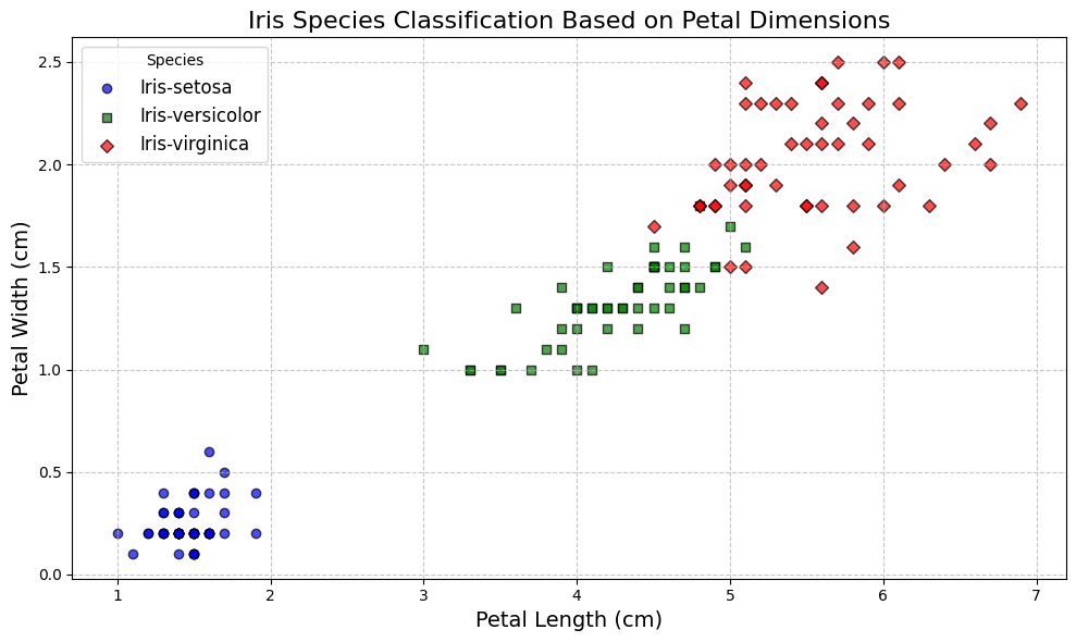
- Visualization:
- An improved scatter plot is created to visualize the distribution of different iris species based on petal dimensions.
- The plot uses distinct markers and colors for each species:
- Markers: Circles for 'Iris-setosa', squares for 'Iris-versicolor', and diamonds for 'Iris-virginica'.
- Colors: Blue for 'Iris-setosa', green for 'Iris-versicolor', and red for 'Iris-virginica'.
- The
plt.scatter()function is used to plot the data, with parameters for marker type, color, and edge color. - A legend indicates the species, with a grid and labeled axes for better clarity.
- The plot provides a visual representation of the feature space and how the different species are distributed based on petal length and width.
import pandas as pd
from sklearn.neighbors import KNeighborsClassifier
from sklearn.model_selection import train_test_split
from sklearn.metrics import accuracy_score, classification_report
import matplotlib.pyplot as plt

# Load dataset
data = pd.read_csv('Iris.csv')  # Use the uploaded file's path
X = data[['PetalLengthCm', 'PetalWidthCm']]  # Features
y = data['Species']  # Target variable

# Split data into training and testing sets
X_train, X_test, y_train, y_test = train_test_split(X, y, test_size=0.2, random_state=42)

# Initialize and train the model
model = KNeighborsClassifier(n_neighbors=3)
model.fit(X_train, y_train)

# Predict on the test set
predictions = model.predict(X_test)

# Evaluate the model
accuracy = accuracy_score(y_test, predictions)
report = classification_report(y_test, predictions)
print(f'Accuracy: {accuracy}')
print(f'Classification Report:\n{report}')

# Improved Visualization
plt.figure(figsize=(10, 6))

# Define markers and colors for different species
markers = {'Iris-setosa': 'o', 'Iris-versicolor': 's', 'Iris-virginica': 'D'}
colors = {'Iris-setosa': 'blue', 'Iris-versicolor': 'green', 'Iris-virginica': 'red'}

for species in data['Species'].unique():
    subset = data[data['Species'] == species]
    plt.scatter(subset['PetalLengthCm'], subset['PetalWidthCm'],
                marker=markers[species],
                color=colors[species],
                label=species,
                edgecolor='black',
                alpha=0.7)

plt.title('Iris Species Classification Based on Petal Dimensions', fontsize=16)
plt.xlabel('Petal Length (cm)', fontsize=14)
plt.ylabel('Petal Width (cm)', fontsize=14)
plt.legend(title='Species', fontsize=12)
plt.grid(True, linestyle='--', alpha=0.7)
plt.tight_layout()
plt.show()
Conclusion
These examples provide a practical introduction to basic machine learning algorithms, model evaluation metrics, and feature engineering techniques. You can download the datasets from the provided links and use the code templates to experiment with different algorithms and techniques.
That's all for today, See you soon. 😸


